Life Tables
Background Definitions
A population
is a group of similar individuals of the same kind living in the same area at
the same time. Each population has characteristics which are unique to that
population, including age distribution, population density, population
distribution in time and space, the birth rate, the death rate, and the
population growth rate. Populations are interrelated with populations of
other organisms. For example, a population of predators affects the
mortality rate of a prey population.
Some organisms (populations) have annual life cycles with
non-overlapping generations. Examples of these would include many herbaceous
plants and many insects. In populations of these organisms, nearly all
members of the population are the same age at the same time. Organisms with
overlapping generations and/or which are continuously breeding, tend towards
a stable age distribution: the ratio of age groups remains the same as long
as birth and death rates remain the same. Note that any influence which
changes the death rate of a population will also affect the birth rate and
age structure of the population. Organisms (populations) of species which
live longer can be divided into three ecological periods: pre-reproductive,
reproductive, and post-reproductive. In these organisms, the length of time
in each stage depends on the overall life history of that species.
In nature, a number of factors determine the rate of increase
(r) of a population of a given species. The maximal rate of increase
under optimum conditions (the innate capacity for increase) is symbolized by
rm. Birth rate
(natality)
and death rate
(mortality)
are influencing factors. Note that the birth rate can be less than, equal
to, or greater than the death rate.
A life table gives the probability at birth of being
alive at age x (designated as lx). At zero age, this is
l0, which by definition, equals one (if lx is
expressed as a fraction of the total if lx is expressed in
whole numbers, l0 will be equal to the total). For example, in a
table where x = 4.5 weeks and lx = 0.87, this means that from a
sample of 100 newly-laid eggs, 87 will survive for 4.5 weeks. Some other
symbols used in these calculations are:
| x | = | a given age group within the population. This might be expressed in days, weeks, or years depending on the life span of the organism, or may be expressed as stages in the life cycle (such as in insects). |
| lx | = | the actual number or the proportion (as a decimal or percentage) of survivors at the beginning of age interval x. Note that since several samples are often averaged together, the lx values may not always be whole numbers. |
| Lx | = | the average (X) number of years lived by all individuals in each age category = (lx + lx + 1) ÷ 2. |
| Tx | = | total number of time units (years, weeks, months, etc.) left for all individuals to live from age x onward = Σ Lx **FROM THE BOTTOM UP!**. |
| ex | = | life expectancy for each interval = Tx ÷ lx. |
| dx | = | the number of individuals that die during time interval x (expressed as an actual number or as a proportion of the total). Note that lx+1 = lx dx. |
| Σ dx | = | the overall number of individuals that died. |
| dxf | = | the cause of death (not a mathematical quantity). |
| qx | = | the mortality rate = dx/lx (often × 100 = percentage or × 1000 = number per 1000). Optionally, qx may also be calculated based on the number surviving at the end of a given time period ÷ the number alive at the beginning of that time period. |
| Mx | = | total eggs or young produced per female at age x. |
| mx | = | the X number of female births to each age group of mothers; the number of eggs or young which are female (in a species with a 1:1 sex ratio, this = Mx/2).
Since, for most organisms, one male can fertilize a number of females, the
size of the population is more dependent on the number of females present,
and the calculations are usually done using only females. |
| lxmx | = | the X number of females born to each age group, adjusted for survivorship, or (prob. of reaching age x) × (# of female eggs at age x) = # of births per female. |
| t | = | some other time interval. |
| lt/lx | = | the proportion of females living from age x to age t. |
| vx | = | the reproductive value of each age group = (lt/lx) × mx. |
| N0 | = | the number of individuals at time zero; the number of females at the beginning of the experiment |
| Nt | = | the number of individuals after time t; the number of females at time t; the number of females after one or more generations |
| R0 | = | Σ lxmx (summed over all ages) = the net reproductive rate;
the ratio of total female births in two successive generations, the ratio of
offspring to parents, or the number of female offspring that will be left
during her lifetime by one female. Also,
R0 = N1/N0 = Nt+1/Nt,
and thus, N1 = N0 × R0 (the population is
growing exponentially). The closer R0 is to 1, the slower the
population growth, and if R0 is less than one, the population is
declining. |
| R0 | = |
N0Σ lxmx
N0 | = | Σ lxmx | = | Nt
N0 |
|
| T | = | the mean time from birth of parents to birth of offspring; the average length of time for one generation; average age of parents who had offspring |
| T | = |
(# of offspring) × (age when had)
total # of births (= R0) | = | Σ lxmxx
Σ lxmx | = | Σ lxmxx
R0 |
|
If rm = maximal rate of increase and T = time for one generation,
then rmT = # of individuals at time T.
By definition, R0 = ermT
or ln(R0) = rmT, thus rm = [ln(R0)]/T
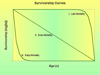 From the information in life tables, various curves may be plotted. A
mortality curve is a plot of qx vs. x. These are often
J-shaped: sometimes there is a high, intitial mortality, but there is
typically a period of low mortality followed by a period of highter mortality
later in life (more die when theyre older). Survivorship curves may be a
plot of lx vs. x, but are more often a plot of
log(lx) vs. x. If the log(lx) is used, survivorship
curves tend to fall into one of three general types, indicative of higher
mortality later in life (I), constant mortality throughout life (II), or
higher mortality early in life (III). Mortality and survivorship curves may
be used to compare survival of the sexes or of populations existing in
different places or at different times.
From the information in life tables, various curves may be plotted. A
mortality curve is a plot of qx vs. x. These are often
J-shaped: sometimes there is a high, intitial mortality, but there is
typically a period of low mortality followed by a period of highter mortality
later in life (more die when theyre older). Survivorship curves may be a
plot of lx vs. x, but are more often a plot of
log(lx) vs. x. If the log(lx) is used, survivorship
curves tend to fall into one of three general types, indicative of higher
mortality later in life (I), constant mortality throughout life (II), or
higher mortality early in life (III). Mortality and survivorship curves may
be used to compare survival of the sexes or of populations existing in
different places or at different times.
Problems
Generic Life Table
Comparing and Interpreting Life Table Data
- The comparison of life tables over a
period of years/generations can help to reveal the influences of climate,
parasites and predators, diseases, food supply, etc. Tables 2 and 3 are
each for one generation of an insect called a spruce budworm in an
experimental plot consisting of 10 sq. ft. of branch surface on the spruce
tree. Note that
instar
refers to an insect or a stage in an insects life in between two molts.
Calculate the qx values and other indicated values for Tables 2
and 3, then in your lab notebook, answer the questions which follow.
Virtual Cemetary
- Life tables can also be applied to
humans. Insurance companies do it all the time.
- Take a walk through this
cemetary (note that while the numbers in the previous problems are
static, you will be transported to a different cemetary each time
you click the Reload button). For each person, record in your lab
notebook the year of death and age at death. (The last guy doesnt
count hes just a Medieval superstition.)
- Sort the people into two
categories based on whether they died before
- Within those categories,
group the people into five-year sub-categories based on age at death
(i.e. 0 - 4, 5 - 9, 10 - 14, etc.)
 |
- Complete the following life
table for these people.
- The total number of people
in each of the two categories (before and after
is l1 for each category.
- Fill in all the
dx values (number of people dying at each age).
- From those, calculate the
lx values by subtracting
(l2 = l1 d1, etc).
- Calculate each
qx value
(qx = 100 × dx/lx).
- Calculate each Lx
value (Lx = [lx + lx + 1] ÷ 2).
Note that L100 = [l100 + 0] ÷ 2.
- Starting at the bottom of
the life table and working your way to the top, calculate the
Tx values (T100 = L100 and
T95 = T100 + L95, etc.). Note
that this Tx means something different than the T in
the first life table.
- Calculate each
ex value (ex = Tx ÷ lx).
This is the life expectancy (how many more years they can expect to
live) of people in each age category.
- Is the life expectance
better for people who died before or during/after
- Can the net reproductive
rate (R0) or the maximal rate of increase (rm)
be calculated for these groups of people? Why or why not?
- In your lab notebook, make
graphs of these data as follows:
- Survivorship curves are useful for comparing the number of
organisms still living at any given time. For each group of
people, make a graph of lx on the Y-axis vs. x on
the X-axis.
- Often, however, survivorship curves are represented by the
logarithm of lx. For each group of people, make a
graph of log(lx) on the Y-axis vs. x on the
X-axis. Which of the three basic shapes is this curve?
- Mortality curves show the rate of deaths. For each group
of people, make a graph of qx on the Y-axis vs. x
on the X-axis. For many organisms, including humans,
mortality curves are often J-shaped, indicating low
mortality at younger ages and high mortality at older ages.
Is that true of this curve?
- It is difficult to create
graphs on-the-fly on the Web. Bar
graphs are do-able, but line graphs are virtually impossible.
Including the scaling on the X- and Y-axes is also difficult to do.
Thus, if you push the following button to view the graphs, these are
approximations of how yours should look. Your line graph should be
the same shape as the top edge of the colored area in each of these
graphs.
Show Me!
Population Age Distribution and Growth Curves
Background
Organisms with overlapping generations and/or which are
continuously-breeding tend towards a stable age distribution. The ratio of
age groups remains the same as long as birth and death rates remain the same.
Any new influence that changes the death rate will also affect the birth
rate and age structure.
Ages are easier to get for humans than wild plants and animals.
Current data for wild organisms often are less predictive of the future
population than in humans because growth is more dependent on local resources.
Humans, however, can move resources to meet their needs. Typically
rapidly-growing populations have generally low or decilining death rates at
younger ages. A graph of such a population would be a broad-based pyramid
indicative of many young in the population. In comparison, stable or
declining populations have lower birth rates, fewer young, and more older
members.
Problems
Age/Sex Distribution by Life Stage
- Four beetles of a species known as
Confused Flour Beetles were introduced into a container holding 8 g of
flour. For the next several months, the numbers of beetles in each stage of
their life cycle (eggs-larvae-pupae-adults) were counted. The following
data were gathered.
- For each TIME:
- Add up all the beetles in
all stages of the life cycle to determine how many beetles, total,
were present (note completed example).
- Then, for each time,
calculate what percentage of the beetles were in each stage of the
life cycle.
Age/Sex Distribution by Age Categories
Similar curves can also be used where the numbers of males
and females are known. Consider the data in Table 6:
Table 6. Census Data from
Mid-1980s
| Community |
North Avondale |
West Norwood |
Active Members,
Church in Norwood
|
| Age |
#M |
%M |
#F |
%F |
#M |
%M |
#F |
%F |
#M |
%M |
#F |
%F |
| 0-5 |
173 |
2.6 |
162 |
2.4 |
367 |
3.7 |
318 |
3.2 |
4 |
2.2 |
8 |
4.4 |
| 5-10 |
136 |
2.0 |
176 |
2.6 |
349 |
3.5 |
379 |
3.8 |
6 |
3.3 |
8 |
4.4 |
| 10-15 |
229 |
3.4 |
192 |
2.8 |
347 |
3.5 |
319 |
3.3 |
7 |
3.9 |
3 |
1.7 |
| 15-20 |
514 |
7.6 |
449 |
6.6 |
465 |
4.7 |
482 |
4.9 |
0 |
0 |
7 |
3.9 |
| 20-25 |
482 |
7.1 |
492 |
7.3 |
536 |
5.4 |
535 |
5.4 |
3 |
1.7 |
4 |
2.2 |
| 25-30 |
260 |
3.8 |
300 |
4.4 |
334 |
3.4 |
411 |
4.1 |
5 |
2.8 |
8 |
4.4 |
| 30-35 |
231 |
3.4 |
229 |
3.4 |
321 |
3.2 |
265 |
2.7 |
7 |
3.9 |
7 |
3.9 |
| 35-45* |
349 |
5.2 |
370 |
5.5 |
505 |
5.1 |
573 |
5.8 |
7 |
3.9 |
13 |
7.2 |
| 45-55* |
302 |
4.5 |
397 |
5.9 |
478 |
4.8 |
598 |
6.0 |
3 |
1.7 |
4 |
2.2 |
| 55-60 |
157 |
2.3 |
185 |
2.7 |
252 |
2.5 |
305 |
3.1 |
3 |
1.7 |
7 |
3.9 |
| 60-65 |
160 |
2.4 |
150 |
2.2 |
223 |
2.3 |
246 |
2.5 |
7 |
3.9 |
7 |
3.9 |
| 65-75* |
178 |
2.6 |
158 |
2.3 |
236 |
2.4 |
392 |
4.0 |
8 |
4.4 |
13 |
7.2 |
| 75+ |
102 |
1.5 |
229 |
3.4 |
217 |
2.2 |
452 |
4.6 |
8 |
4.4 |
23 |
12.8 |
| Σ = |
3273 |
48.4 |
3489 |
51.6 |
4630 |
46.7 |
5275 |
53.3 |
68 |
37.8 |
112 |
62.2 |
| Σ = |
6762 |
9905 |
180 |
From these data, similar graphs can be constructed, again
with percent on the X-axis. Again, the percentage of males is plotted to the
left of center and the percentage of females to the right of center. Age (or
age groups) goes on the Y-axis. A graph of data from the community of
Evanston would look like Figure 3.
Figure 3. Population Age/Sex
Distribution for Evanston
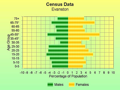
- Make age distribution graphs for the
three populations for which data are given in Table 6.
- Which of the populations
has the most even age distribution?
- In an increasing population,
this sort of age distribution graph should form a triangle which is
wider at the base, tapering to a point at the top. In a population
of stable (or decreasing) size, the graph will be fairly rectangular
with about the same number of people in all the age categories.
Which does each of these populations resemble?
- Can you generalize about
which populations are growing, declining or stable?
- In general, based on the age
distribution curves, would the Norwood church be a place you could
go to meet other people your own age? How does the age distribution
graph support your answer? Back in the 1990s, that church closed its
doors and sold the property. How do you think the
demographics
of the congregation would have contributed to that decision?
Copyright © 1998 by J. Stein Carter. All rights reserved.
This page has been accessed  times since 25 Jun 2001.